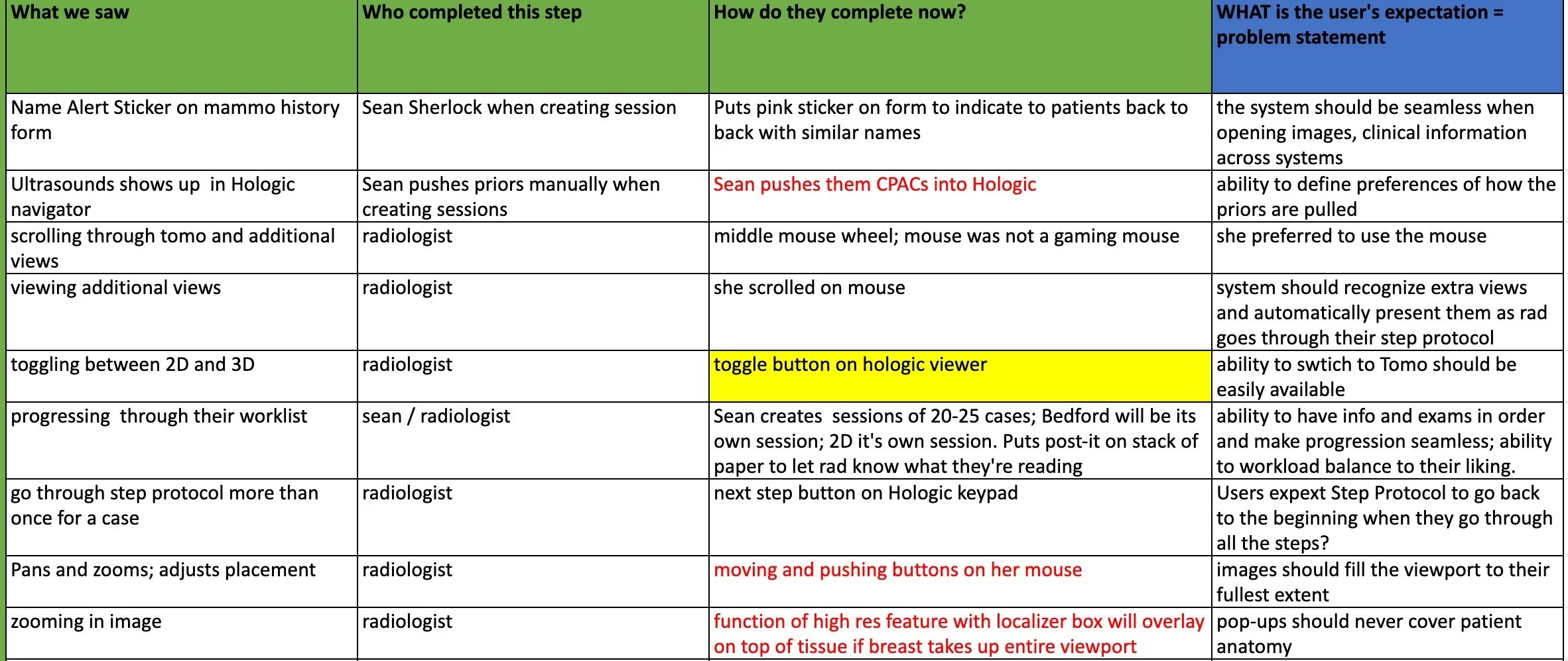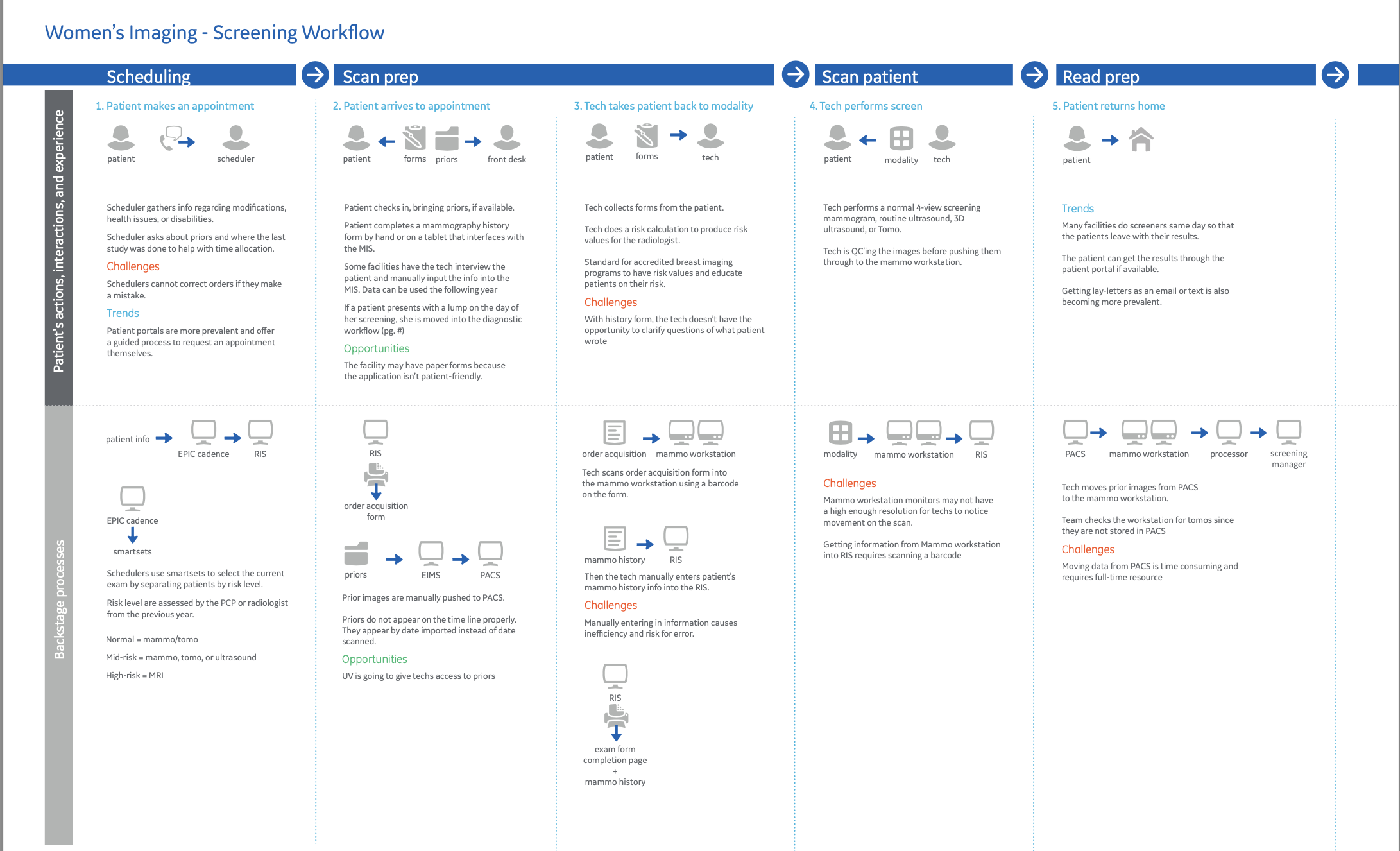
Building radiology imaging software was the most complex design challenge.
It was also my favorite.
This project had everything: Complex workflows, stressed end users, federal regulations, lots of data, and project timelines that were moving targets.
It often pushed me to the edge of my expertise. Through this work, I came away with a defined strong practice around research, project planning, and multi-disciplinary collaboration. It cemented my passion for service design as framework for building software.
-

Scrolling through 1000's of Images
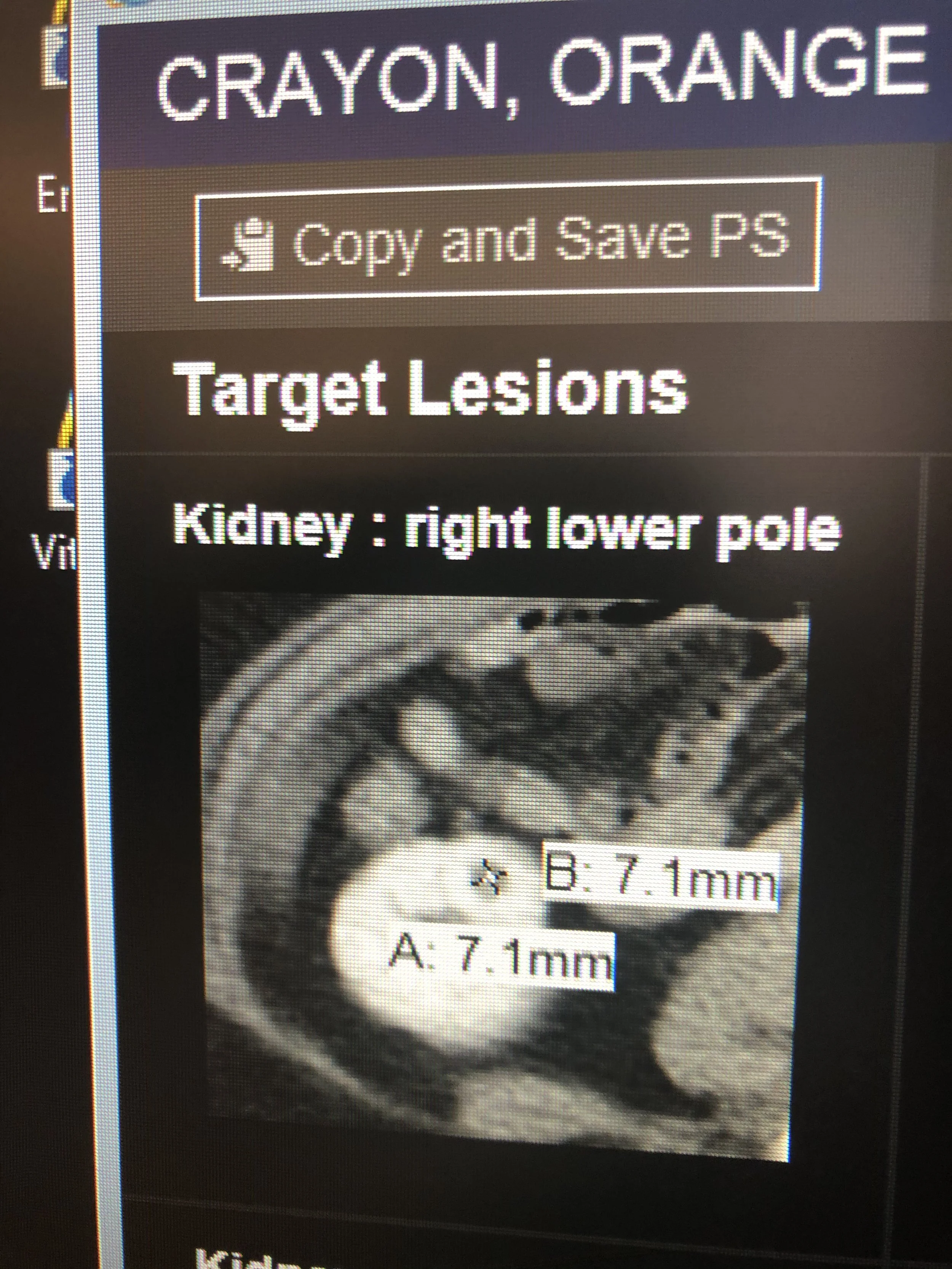
This is an example of a viewer interface built by GE Healthcare. Radiologists scroll through images, hang comparisons, and annotate as part of their diagnostic process.
-

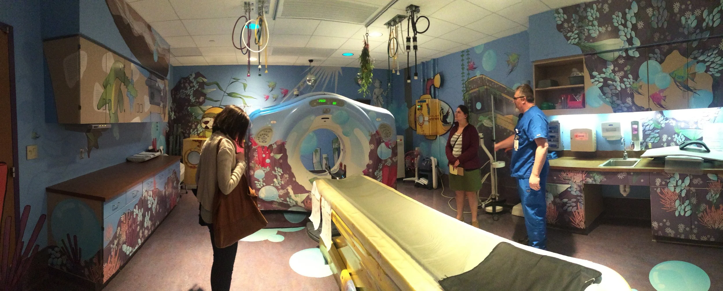
Working in the Dark
Radiologists work in a unique environment. Rooms are typically dimly lit or completely dark. It makes user research slightly more challenging!
-
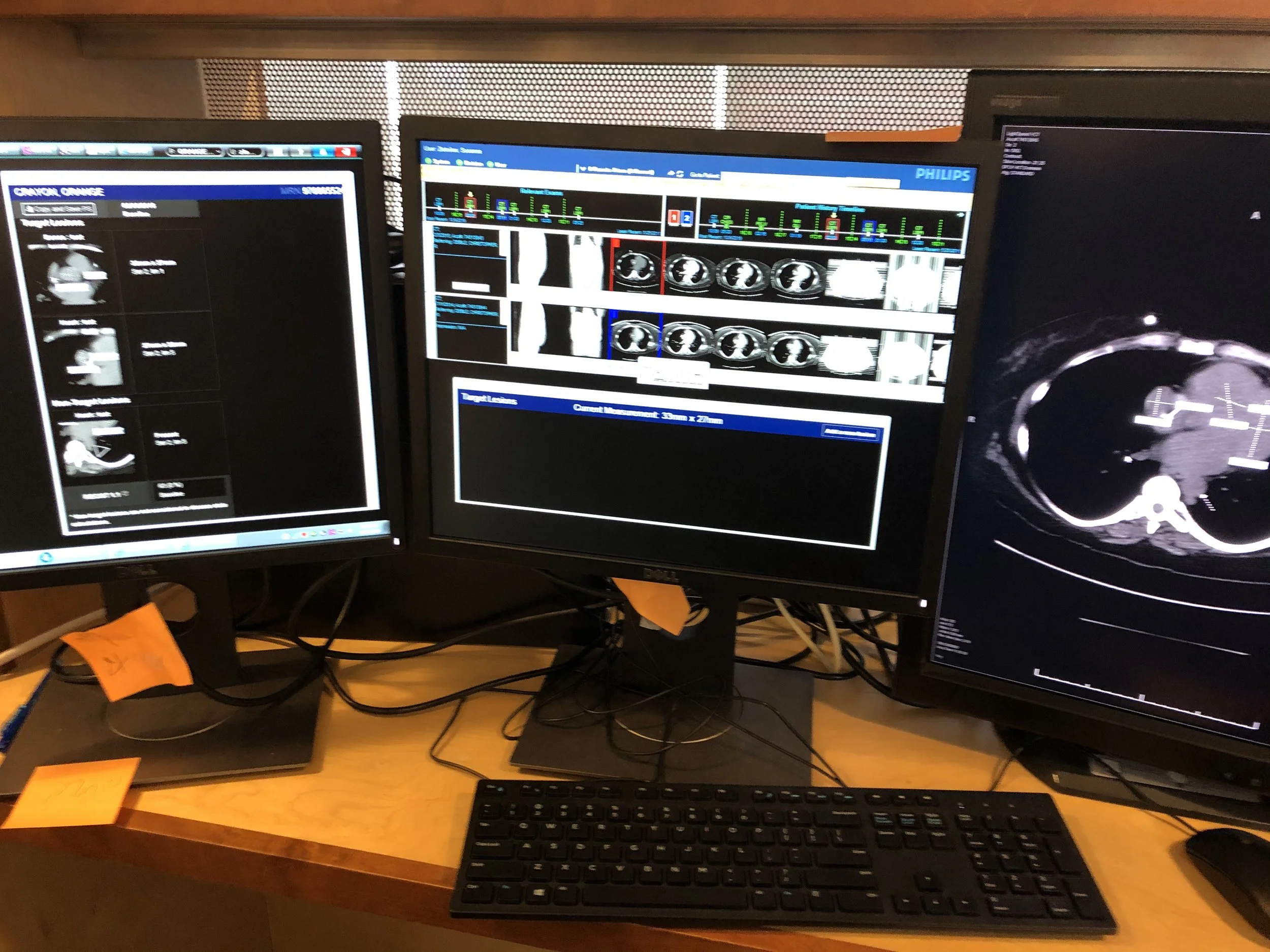
Minimum of 3 monitors
Radiologists use a lot of monitors to do their work. Configuration is quite complex.
Skill highlight: a 60-second research study
Devising user-centered user research methods
Research is part of your user’s experience. For this project I needed to understand level of impact on the radiologists if we took away their keyboard.
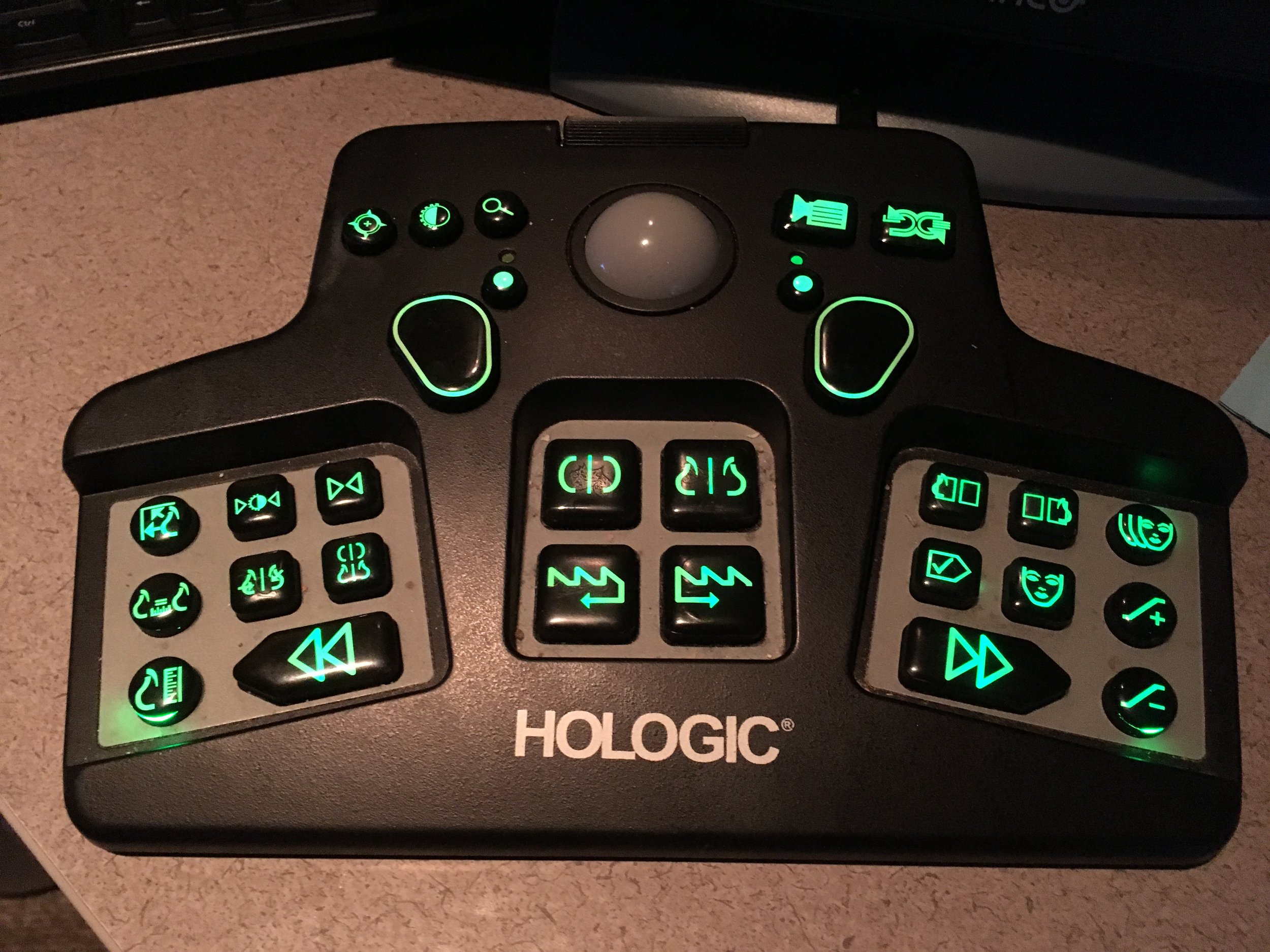
This was a part of the software gap analysis between UPMC Breast Imaging Radiology’s current vendor and GE Healthcare’s solution. Hologic’s solution includes a proprietary keyboard which GE did not have.
In the dark, I could only see that radiologists were pressing buttons but it was hard to tell which ones and why. Radiologists didn’t have a lot of time to walk me through. I had to figure out a way to get the data I needed.
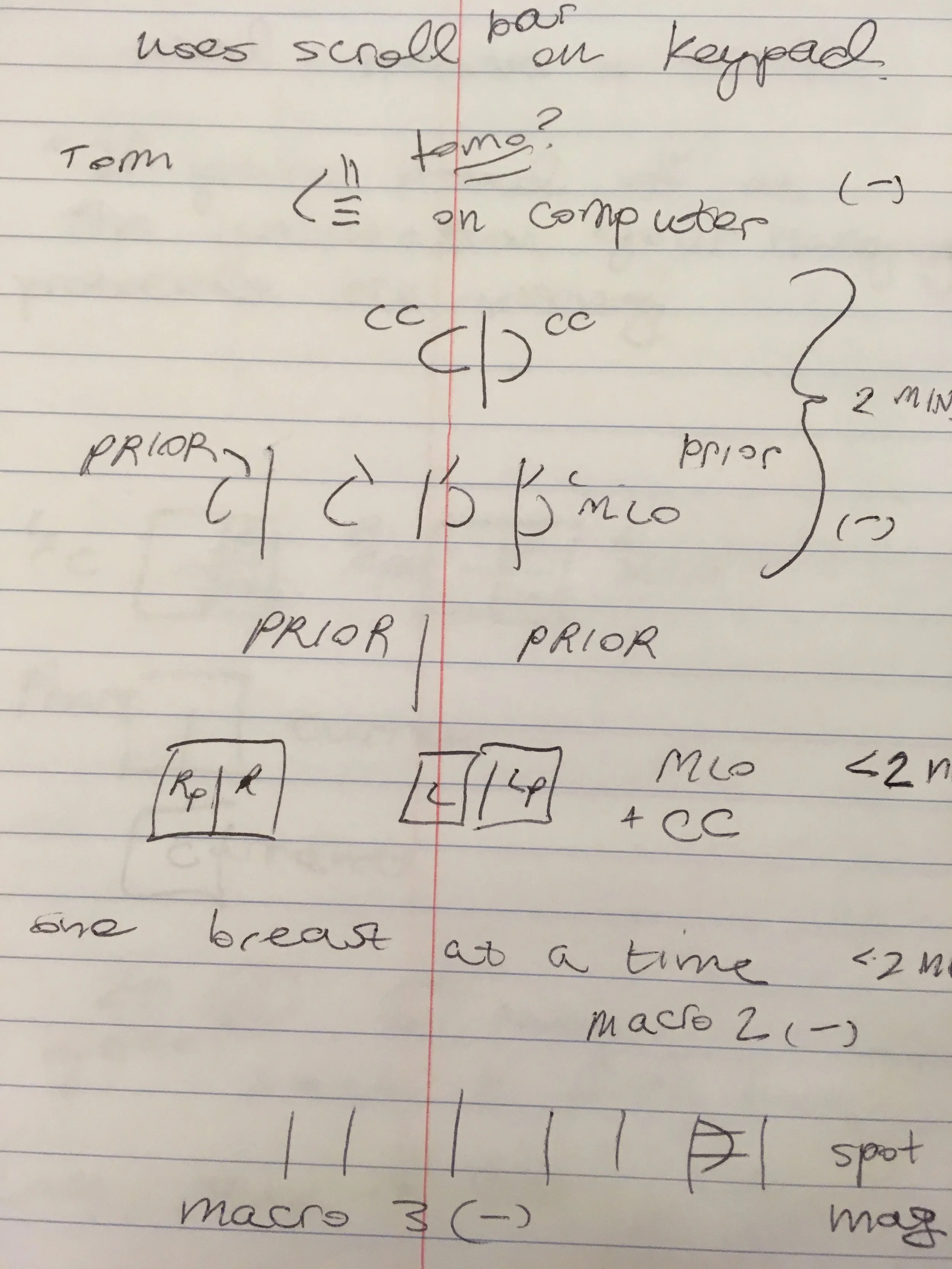
Light bulb! Do we use every button on our tv remotes? Maybe this is kinda the same thing?! I devised a worksheet and had participants color based what buttons they used all the time, which they never used, and which they didn't even understand. The worksheet took seconds to annotate and allowed me to capture a visual representation of usage.
Hologic’s proprietary keyboard
Annotated worksheet. Buttons are color-coded by level of use.
Additional research and design work for radiology imaging software
Leveling up my design expertise
The biggest area of growth through this work crafting user research as part of the user experience.
The power of co-design is immense but a huge effort. Maintaining communication with external and internal stakeholders is key.
Complex product service systems require ongoing user engagement. Every interaction we have with our users is an opportunity to strengthen connection to the organizations we represent.
